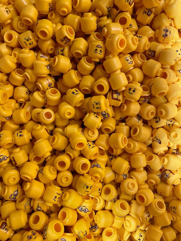

Yellow is the color you can’t ignore. It grabs attention, adds energy, and signals positivity. Its brightness naturally draws the eye, which is why it’s used in warning signs, traffic signals, and “sale” tags. Beyond alertness, yellow conveys optimism, warmth, and creativity, making it a popular choice for brands that want to feel playful, youthful, or approachable. It is the color of sunlight, joy, and new beginnings—qualities that make it especially powerful when a brand wants to project openness and enthusiasm.
In fashion, yellow is bold and unapologetic. Wearing it is often a statement — a reflection of confidence, individuality, and lightheartedness. Lighter tones, such as butter yellow or pastel lemon, bring softness and approachability, perfect for spring wardrobes and casual wear. On the other hand, deeper shades like mustard or golden yellow carry a sense of grounded sophistication, balancing playfulness with maturity. Accessories in yellow — from handbags to sneakers — often act as uplifting accents that instantly refresh an outfit.
In interior design, yellow is equally transformative. A yellow accent wall, throw pillow, or lamp doesn’t just add color — it changes the atmosphere of a room. Soft yellows in kitchens or dining spaces make them feel more welcoming and cheerful, while richer tones can create warmth and coziness in living rooms or reading corners. Designers often recommend using yellow in moderation: as a highlight rather than the dominant palette, allowing its uplifting quality to shine without overwhelming the space.
In design, yellow is most effective in moderation. As an accent, it creates focal points that immediately capture attention, energize a layout, or highlight key information. Think of a yellow call-to-action button on a website or a yellow detail in packaging—it pops without overwhelming. Used as a dominant color, however, yellow must be balanced with neutrals such as white, gray, or black to remain readable and stylish. Without balance, yellow can fatigue the eye or feel too chaotic. Designers often rely on yellow in combination with other colors to guide hierarchy and flow, especially in digital interfaces.
What makes yellow so unique in lifestyle is its balance between attention-grabbing energy and emotional warmth. It can be playful, creative, and childlike, but also sophisticated when used with intention. Pairing yellow with natural tones — like beige, white, or soft gray — creates a grounded, modern lifestyle aesthetic. When paired with deeper colors like navy or plum, it takes on a more striking, artistic edge.
Ultimately, yellow is a color of optimism and action. Its energy makes it impossible to ignore, but its effectiveness depends on thoughtful use. Carefully placed, it sparks excitement, lifts moods, and energizes communication. Overused, it risks becoming chaotic or difficult to read. When applied with balance, yellow is one of the most powerful tools in design, capable of brightening spaces, energizing brands, and leaving an unforgettable impression of positivity.
Leave a Reply
You must be logged in to post a comment.