Red is the color of urgency. It grabs attention faster than any other shade, which is why it shows up in sales tags, stop signs, and “buy now” buttons. Its high visibility makes it one of the most instinctive and universal colors for alertness and action. But beyond urgency, red also signals passion, power, and confidence, giving it a versatile emotional range that can shift depending on context. It can be both a warning and a celebration, both danger and desire. This duality is what makes red such a powerful and complex tool in communication and design.
Historically, red has carried immense cultural weight. In ancient civilizations, it symbolized life, strength, and protection, often tied to fire and blood. In China, red is still associated with luck, prosperity, and joy, making it a central color in festivals and weddings. In Western cultures, it has long been tied to love and seduction, which is why red roses and red hearts dominate Valentine’s Day. At the same time, red has been the color of revolution, protest, and authority, used in flags, uniforms, and political movements. Few colors can claim such a wide spectrum of meaning.
Psychologically, red stimulates energy and quickens the pulse. Studies suggest that it can increase metabolism, heighten attention, and even influence decision-making. This explains why it is so common in retail environments and food branding. Fast-food chains, for example, often rely on red to create a sense of appetite and urgency. In sports, red uniforms are believed to give athletes a psychological edge by projecting dominance and intensity.
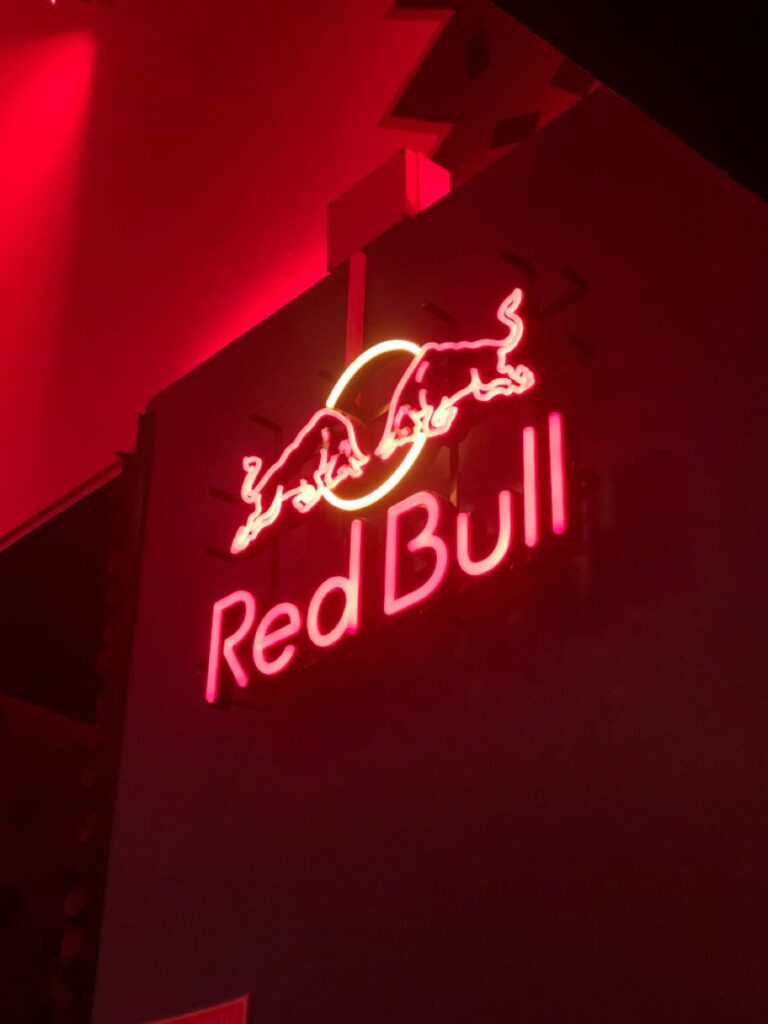
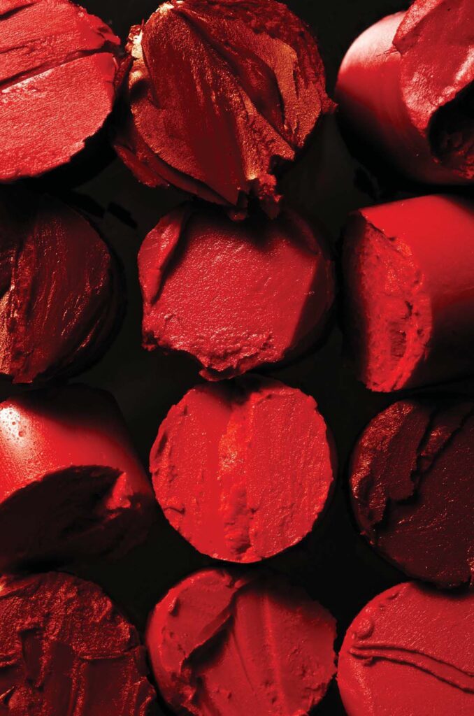
In lifestyle and design, red injects vitality wherever it appears. It can transform a space as a bold accent wall, bringing warmth and personality to interiors. In fashion, a red dress or lipstick shade makes a statement of confidence and allure. In branding, red logos—from Coca-Cola to Netflix—signal boldness, energy, and mass appeal. Even in subtle touches, like packaging details or website call-to-action buttons, red draws the eye and guides behavior.
Use red when you want to push action, spark excitement, or highlight intensity. Like yellow, it’s most effective in balance: too much red can overwhelm, agitate, or feel aggressive, but applied thoughtfully, it becomes unforgettable. A well-placed touch of red can turn a design from ordinary to iconic.
Pairing red with neutrals such as black, white, or gray allows it to stand out without overpowering, creating a sense of sophistication. When combined with complementary shades like green or teal, red creates striking contrast and visual energy, perfect for bold or playful branding. For a more luxurious feel, pairing red with gold or deep navy can elevate it into a symbol of richness and prestige.
Ultimately, red is more than just a color of urgency—it is a communicator of emotion, energy, and power. Its versatility makes it one of the most impactful colors in design, capable of commanding attention, evoking strong feelings, and leaving a lasting impression. Used with intention, red is not just seen—it is felt.